Tampilkan postingan dengan label Fan Art. Tampilkan semua postingan

Rabu, 01 Desember 2010

I Find This Photo Odd: Double Moustache Man Edition


I know the eyes are drawn to the surly cartoon villain features of Brent Sutter, but the real star of this photo is the facial hair of the man to his left. Unlike any beard I have ever seen, this Flames fan appears to be growing separate moustaches for his upper and lower lips. This guy was behind Sutter all night. During bench shots, I kept seeing him and wondering, just what in the heck is going on there?

Perhaps it's a tribute to a classic Sigur Ros album. Perhaps he's very sensitive about his otherwise thin lips. Whatever the purpose, his unfortunate double moustache makes him look like an Amos n' Andy photo negative. Somebody should tell him that when Movember ends, you shave off your moustache, you don't give it a playmate.

I'm sure he's a very nice man and I mean him no disrespect, but this is some odd way to decorate one's face. Quasi-beardishness of this sort is odd, and as a result, I find this photo odd.

Senin, 03 Mei 2010

Vancouver vs. Chicago: Playoff Fan Art, Volume 2

Let's catch you up, in case you've never been here before. A few days back, I tried to start a Henrik Sedin photoshop contest over at Canucks.com. It didn't work, but it did manage to combine with another series of photoshop requests forum members had, and eventually turned into a big photoshop party, primarily led by excellent photoshopper and forum member egatti. His work is above, and it's the best HenKik we've seen yet. He's also the creator of a ton of images below. As with last time, click on the images for larger versions. I think this one's big enough to be a wallpaper. Let's have a look at some other stuff the CDC forum has provided us.

This one's egatti again, and is the best of a series of twin-related images. My only quibble: I refuse to give a thumbs-up to any image which could depict a paler Canuck than Sami "The Friendly Ghost" Salo. It's just not believable.

Also egatti. He's good at what he does. I especially like the "H/D Sedin touch, as well as the fact that they're wearing number 32. But let's not kid ourselves. Daniel is, for some odd reason, always the other brother. If they were indeed one person, they'd probably be known primarily as Henrik.

This is an unnecessary photoshop by MAKAVELI96. This photo will be real in about three months anyway.

This one simply settles up an issue I had originally with the photoshop job on HenKik: the greenness of Dustin Byfuglien's head. It's a simple enough fix, so it shouldn't come as any surprise that egatti got around to it.

Here's another egatti original, and I think it might be the best use of the SpearBuff image. If I'm not mistaken, the rat body is originally that of Emile from Ratatouille. Love the look on Salo's face.

Returning to the infantile "Blackhawks are gay" motif, which is all over the forum (should we be surprised? what do you think is the average age of the posters?), here's the Village People image, brought to its logical conclusion. *sigh* Let's move on. Its by posttraumatic, by the way.

This is a much better Blackhawks joke. Granted, Patrick "20 Cent" Kane jokes are getting a wee bit tiresome, but as of yet, they're not so old that I can't handle a decent photoshop like this one. I especially like the title. This one's by canuckletux.

Another egatti original, and I love it. It's fabulous. First of all, it takes about two looks to realize what's going on. Second, "Blue Steel" is about as good a nickname for Ryan Kesler as you're going to find. But let's hope that looking good with feathered hair is all these two guys have in common, because Kes is going to have to turn left a lot tonight.

Jumat, 30 April 2010

Vancouver vs. Chicago, Playoff Fan Art! Volume 1

My oh my, have we had a lot of fun with photoshop today. Can you tell it's the day before a big game? It's only been about four hours since I launched PiTB's first ever photoshop contest, but I'm going to be honest with myself: it's not going to happen. PiTB is no Puck Daddy, and the best photoshoppers/hockey fans don't have us on their blogroll. Yet. Our time will come.

In the meantime, however, I've stumbled across something almost as good: playoff fan art from Canucks.com. You see, there is a second battle on the horizon, and it's between Vancouver's fans and Chicago's fans. With a year of context and hatred under our hats, the fan art is out in full force. Let me show you what I mean. Click on all images for larger sizes.

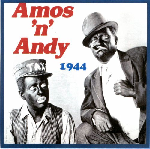
First, there's the photo above. It's just a normal photo, but it was introduced to us by forum member BeExcited, hoping somebody could use it for some excellent photoshopping.


So far, I've seen one entry and it's this one. It turns out Canucks.com is not the place for intense and competitive photoshop contests. Anyhow, BeExcited's photoshop contest conflated with my photoshop contest, and neither really went in any new directions.


It really only led to this. And, as much as I'm happy to see people disseminating my art, I'm not sure this is an improvement. Oh well, I guess it's a little more topical (not the most topical, but definitely moreso). That said, somebody needs to tell this photoshopper about color balance. He could have matched the green in Blanka's skin to Byfuglien's head quite easily. But who has the time for that? Speaking of time...


The best photoshop utilized neither HenKik(TM) nor SpearBuff. But it did inspire the joint effort above, from Pinkyandthebrain and Egatti. See, because the Blackhawks are gay, or something? I think only a few of them were gay, but I get what was intended. Originally, only Patrick Kane was photoshopped in here, but eventually, at the behest of the rest of the forum, a place was found for everybody. From left to right: Hossa, Kane, Dustin "Feather-Ryfuglien" Byfuglien" (no?), Jonathan Toews, Patrick Sharp, Andrew Ladd. All present and accounted for. Remarkably, the guy Andrew Ladd replaced used to be black. That is seamless.


This one makes me uncomfortable because, um, well, they still look good to me... maybe? No, wait, no, I didn't say that. I see what patsajac is going for, but, well, the less said about this one the better.


And then there's this, by Trevor19Naslund This looks hand-drawn to me and I'm not sure what to make of it. I'm going to assume that the irony of an orca shooting an aboriginal person in the face is lost on the artist. Note, as well, the misuse of the blowhole: see, it's how they breathe, not a valve that releases when they're aroused by murder. It's a killer whale, not a serial killer whale.

This completes the first of what I hope to be many rounds of Vancouver vs. Chicago fan art. Oh, uh, wait, there's also this one, but click at your peril. And, if you think it's maybe a bit optimistic, redstar504 changed it to this, which is just as perilous. *sigh* You should probably just click them.

Anyhow. If you have any more to add, please, drop me a line at passittobulis@gmail.com.